Excel 2016 Insert Tab Lesson-2
Excel 2016 Insert Tab Lesson-2
Insert:-The Insert tab contains various items that you may want to insert into a document. These items include such things as tables, word art, hyperlinks, symbols, charts, signature line, date & time, shapes, header, footer, text boxes, links, boxes, equations and so on.
Pivot Table:- A pivot table is a special type of summary table that's unique to Excel. Pivot tables are great for summarizing values in a table because they do their magic without making you create formulas to perform the calculations. Pivot tables also let you play around with the arrangement of the summarized data. It's this capability of changing the arrangement of the summarized data on the fly simply by rotating row and column headings that gives the pivot table its name.Follow these steps to create a pivot table:
Open the worksheet that contains the table you want summarized by pivot table and select any cell in the table.Ensure that the table has no blank rows or columnsandthat each column has a header.
Click the PivotTable button in the Tables group on the Insert tab.Click the top portion of the button; if you click the arrow, click PivotTable in the drop-down menu. Excel opens the Create PivotTable dialog box and selects all the table data, as indicated by a marquee around the cell range.
If necessary, adjust the range in the Table/Range text box under the Select a Table or Range option button.If the data source for your pivot table is an external database table created with a separate program, such as Access, click the Use an External
Data Source option button, click the Choose Connection button, and then click the name of the connection in the Existing Connections dialog box.
Select the location for the pivot table. By default, Excel builds the pivot table on a new worksheet it adds to the workbook. If you want the pivot table to appear on the same worksheet, click the Existing Worksheetoption button and then indicate the location of the first cell of the new table in the Location text box.
Click OK.
Excel adds a blank grid for the new pivot table and displays a PivotTable Field List task pane on the right side of the worksheet area. The PivotTable Field List task pane is divided into two areas: the Choose Fields to Add to Report list box with the names of all the fields in the source data for the pivot table and an area divided into four drop zones (Report Filter, Column Labels, Row Labels, and Values) at the bottom.

To complete the pivot table, assign the fields in the PivotTable Field List task pane to the various parts of the table. You do this by dragging a field name from the Choose Fields to Add to Report list box and dropping it in one of the four areas below, called drop zones:

Report Filter: This area contains the fields that enable you to page through the data summaries shown in the actual pivot table by filtering out sets of data
they act as the filters for the report. So, for example, if you designate the Year Field from a table as a Report Filter, you can display data summaries in the pivot table for individual years or for all years represented in the table.
Column Labels: This area contains the fields that determine the arrangement of data shown in the columns of the pivot table.
Row Labels: This area contains the fields that determine the arrangement of data shown in the rows of the pivot table.
Values: This area contains the fields that determine which data are presented in the cells of the pivot table — they are the values that are summarized in its last column (totaled by default).
Continue to manipulate the pivot table as needed until the desired results appear.

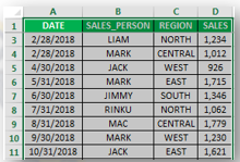
Below mentioned data contains a compilation of sales information by date, salesperson, and region; here, I need to need to summarize sales data for each representative by region-wise in the chart.
To create a Pivot Chart in Excel, select the data range.
Then click the Insert tab within the Ribbon.

Then select the PivotChart drop-down button within the Charts group. If you want to create a PivotChart only, then select PivotChart from the drop-down or if you want to create both a PivotChart and PivotTable, then select PivotChart PivotTable from the drop-down.

Once you click OK, It inserts both PivotChart PivotTable in a new worksheet.

Then the chart looks like as given below.


Pictures - Displays the "Insert Picture" dialog box allowing you to browse to a file
Online Pictures- Click the location in your worksheet where you want to insert a picture.
On the Insert ribbon, click Pictures.
Select This Device…
Browse to the picture you want to insert, select it, and then click Open.
Shapes - Drop-Down. The drop-down contains the commands: Recently Used Shapes, Lines, Rectangles, Basic Shapes, Block Arrows, Equation Shapes, Flowchart, Stars and Banners and Callouts.

Screenshot -Drop-Down. The drop-down contains the commands: Available Windows and Screen Clipping.


 Other Chart:-Excel offers other chart types, such as Stock, Surface, Doughnut, Bubble, and Radar. To locate a menu of all available chart types in newer Excel versions, begin to insert any chart type and click All Chart Types ... The image below shows the menu that displays—menu may look different on your version of Excel.
Line - Displays the "Create Sparklines" dialog box which lets you insert a line chart within a single cell.

Win/Loss - Displays the "Create Sparklines" dialog box which lets you insert a win/loss chart within a single cell.
Slicer:-Filter dates in your Tables. Exactly the same command can be found on the Table Tools -


Text Box:-You may want to insert a text box into your document to draw attention to specific text or have the ability to easily move text within a document. Text boxes are basically treated the same as shapes, so you can add the same types of effects to them and can even change their shape.
Header:-The header is a section of the document that appears in the top margin, while the footer is a section of the document that appears in the bottom margin. Headers and footers generally contain information such as the page number, date, and document name.
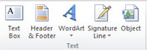
Word Art :- WordArt is a quick way to make text stand out with special effects. You begin by picking a WordArt style from the WordArt gallery on the Insert tab, and then customize the text as you wish.
Signature line:- To insert the signature line, place the insert cursor where you need to insert & navigate to Insert tab, under Text group, click Signature Line. A message will pop-up, click OK to add signature details. It lets you change the instruction to signer while offering you to add suggested signer's title.
Object:- Depending on the version of Word or Outlook you're using, you can insert a variety of objects (such as PDF files, Excel charts or worksheets, or PowerPoint presentations) into a Word document or an email message by linking or embedding them. To insert an object, click Object on the Insert tab.
Equation:-When writing a document which primarily covers mathematical signs and equations then using Word 2016 built-in Equation feature would be of great help. In Word 2016, you can insert Equation from the built-in list instantly. Handling equation that you have written by yourself would be a bit tedious task to get by, but through this feature of Word you can manipulate them by performing simple actions and clicks. In this post we will explain how easy it is to use Equations in Word.

More Symbols option to have a wide range of symbols as shown below in the symbol dialog box. You can select any of the symbol and then click the Insert button to insert the selected symbol


Comments
Post a Comment